
Do you want to join the uprising? Click here to see a list of all groups around the world
A shining sun, playful children, overwhelming greenery and new neighborhoods with a richer wildlife than a Zoo. We have all seen them, the vision images that promise an idyll but result in a visual nightmare. Here‘s a few examples.
Renderings are a visual representation of a future scene or product. These images are used as a selling tool in architecture, allowing architects to present their ideas to clients and investors. Through the use of computer programs like Photoshop or AI, these images can be created with great detail and realism. However, this ability to manipulate the rendered image has led to some controversy. What we call fake views, are a common way for architects to sell their projects to decision-makers and residents.

In his essay “Digital Deception,” architect Belmont Freeman criticizes the tendency of architects to use technology to embellish renderings to the extent that they become outright misleading. He argues that this obsession with the perfect image has resulted in a detachment from reality in architecture, with the idea itself, the image of architecture, taking precedence over the realism or feasibility of the vision in reality.

Freeman’s argument is echoed by journalist Vanessa Quirk, who argues in her article “Rendering/CLOG” that unreal renderings are a way for architects not only to persuade skeptics but also to deceive themselves. She highlights the fact that studies show people are drawn not to buildings but to the atmosphere of the image, and that it is people and life that should sell a project, not the design of the buildings.

The Tricks That Architectural Firms Use to Sell Ugly Projects
After looking into the subject for years, I have identified a of recurring patterns, or tricks, that are used to embellish renderings and thus sell projects on false premises.
- Eternal summer. Nice and sunny weather with blue skies.
- Exaggerated, and constant, greenery.
- The facades, or the images as a whole, are brighter than in reality.
- No, or very few, cars.
- Exaggerated number of pedestrians and cyclists.
- Exaggerated number of playing children.
- An exaggerated number of wild animals.
- Other rare phenomena, such as hot air balloons and zeppelins, are overrepresented.


Creating Unrealistic Expectations That Will Never Be Fulfilled
It is a democratic dilemma when the public is led into ambitions that evidently cannot be fulfilled by the urban planning apparatus. If the focus is on making the renderings as realistic as possible, citizens interested in urban planning issues will have a greater opportunity to feel more involved and be more involved.
While vision images can be a valuable tool for architects, their use must be tempered with a degree of realism. Architects must not use them to create unrealistic expectations that will never be fulfilled, and they must focus on conveying the true essence of their vision to their clients and the public.


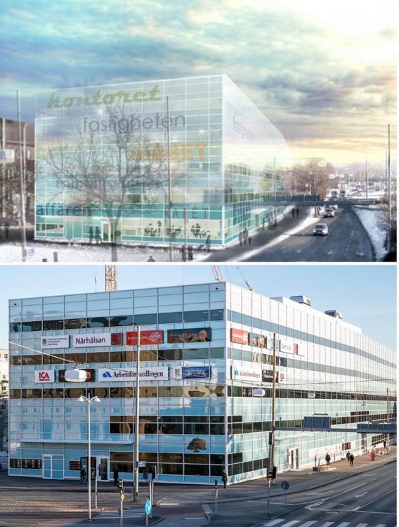
A Few Examples From My Last Article on Fake Views
In 2018, I wrote an article on this subject in Swedish that went viral. Here’s a few examples from the Swedish article. Do you have any more examples? Please comment!


Peter Olsson
Author
Kan du visa Tors torn före och efter? Före hade inga “helikoptrar ” på taken. Även det ovala science huset i korsningen Solnavägen Hagagatan såg mkt snyggare ut på ritning. Likaså VHC på Ultuna i Uppsala. De nya husen vid centralen i Uppsala får en att må illa. Sneda fasader och olika stora fönster i ett virrvarr. Fy tusan!!
Tack för tipsen. Ska kolla upp allihop!
Menade korsningen Solnavägen-Tomtebodavögen!
Elbphilharmonie Hamburg, in my opinion the only building that looks better in reality than in rendered images, which look like something made of cobwebs. Perhaps the result of costs skyrocketing during construction.
The nearest example I have is “la nuvola” (the cloud?) by archistar Fuksas, a congresso center in Rome. It turned out to be a blob inside an enormous cage, very different from the initial renderings.
There is, after ll, a party named The Developer, whobuys these images but believes in a dogma called coste-efficiency, where customers’ or the public’s reaction has no monetary value to enter the formula.
The municipal interest is covered with the plot value…
Whilst there’s some validity in the underlying theme here, I think some care should be taken in the selection of the images to represent the argument.
I would suggest the majority, if not all, the images chosen would be design development images or images in the early stages of a project – given this, its almost impossible to portray a scheme [realistically] that is likely to change significantly over the course of the design evolution.
What a load of bs. You can see clearly they’re NOT design development images. The rendered /CAD buildings and shapes (bar the transparent cherry blossoms) are identical to what the in-reality shots show. This has got to stop, London has become a cesspool of hideous buildings. Walky talky being one…the people in councils who sign off these buildings should be put to trial for allowing such scars on our cities, lining developers pockets..where’s the thought for social homes, mixed use, and residential that younger people can invest in! These buildings are filth. As if a beautiful fox would find its home there!!
I think a lot of these images are just showing how Value Engineering ruins an architectural concept. We should reconsider the word “value”.
The visual effects problem seems secondary to the initial concept problem: the fact that either the architect is designing buildings that they know will never be built as designed, or the fact that builders aren’t building to the architect’s specifications. The only buildings here that look like the initial concept are the Milner Library and the tower in Aspern Seestadt look structurally the same as initial renderings.
And yes, the lighting and greenery were effectively lies about what atmosphere they’d bring to the area, but also the “reality” photographs are also lies (though not to the same degree). Not all views of these buildings will have *no* greenery and shitty lighting and no people and cars/construction 24/7 and, in fact, sometimes it actually is Summer.
The reality is closer to the “reality” shots, but it’s not quite exact.
As an architectural photographer, this topic interests me greatly, and I am keenly aware of the need to represent buildings faithfully, but also show them off at their best, because my client is the designer and they are trying to run a business (as well as having social responsibility). I will be the first to admit that renderings often don’t represent reality. The most egregious example I’ve seen recently is the renderings of the proposed designs for London’s Liverpool Street and Euston HS2 stations, where entire oversite developments have been rendered as white, semi-transparent, barely visible boxes, in an effort to make you not notice them. On the flip side though, in these examples, the “reality” photos are equally guilty of the same problem in reverse. They are shot in bad light, at a bad angle, when the building wasn’t fully finished. It would be more interesting to see professionally shot photos too, and even better, visit in reality, because that really is the litmus test.
The interesting part for me is that the glass is so transparent also as if to show what life would be like as someone insider the building – yet it’s from hundreds of metres away and you can’t see any detail inside the building. If the glass on my bedroom windows were so transparent I’d be concerned about privacy and their efficiency!
Great article